Branding battle brewing over new logo proposed for Palm Springs International Airport
Palm Springs has no shortage of designers and architectural experts. A few took to social media over the weekend to start a conversation about a proposed rebrand of the logo used for Palm Springs International Airport.
Local designers and others are urging their neighbors to call or write city officials in advance of this week’s Palm Springs City Council meeting. At issue is concerns with the re-design of the Palm Springs International Airport (PSP) logo.
Last year, the city hired a consultant to research and develop a new marketing and communications plan for PSP. The consultants met with chambers of commerce and performed market research surveys of some residents.
- The consultants said they found a perception that PSP is too expensive, has too few flights, and that it’s a seasonal airport that shuts down in the summer months.
- A rebrand, they said, would help combat those perceptions.
Local reporting and journalism you can count on.
Subscribe to The Palm Springs Post
Next up: Those who were consulted are recommending councilmembers approve the “Modern Palm” design (option No. 3). If passed on Thursday as one of dozens of items on the consent agenda, there won’t be much debate before it becomes the new airport logo.
But wait: Palm Springs has no shortage of designers and architectural experts in its robust creative community. A few took to social media over the weekend to start a conversation about the rebrand.
- Many were alarmed after seeing the finalist recommended by city staff and others. They mounted a grass-roots campaign to urge elected officials to take a step back and listen to their input.
At issue: Tom Dolle —the creative director behind Destination PSP — said the entire project was “ill-conceived.” He laid out seven major problems, taking umbrage with the fact that the entire project seems to ignore the architectural significance of the airport’s main building, designed by Donald Wexler in the 1960s.
- “The monument signs outside the airport should be treated as part of the architecture,” he said, “not as a place to slap a branded logo like it’s a strip mall.”
- Dolle also said the “S” in the design is “awkward and totally indecipherable, and the color palettes are garish.”
The other side: The consultants say Design #3 actually “(D)raws deeply from the region’s architectural history, including Bauhaus and midcentury modern …a s well as the area’s vibrant natural yet resort environment.”
- They also think the new branding “nods to the region’s iconic past while propelling the airport effortlessly into the future.”
Details: Thursday’s meeting starts at 5:30 p.m. You can watch it on YouTube or on Channel 17 on Spectrum.
Read the full staff report on the project here.
Author

Related Articles
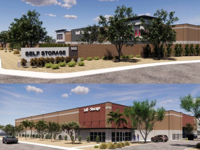
Commission approves self-storage facility near airport even as city weighs limits on new facilities
A 92,400-square-foot, two-story building with outdoor RV parking won approval Tuesday, while a consulting team examines possible caps and location rules for future projects.
Parks & Recreation Commission approves agreement with newly formed foundation
The agreement, which heads to city council for final approval May 27, outlines a fundraising partnership built around water, shade, and park activation.

Palm Springs boards and commissions tackle tourism, self-storage and investment policy this week
Four city panels meet over three days, with sessions covering a proposed 92,400-square-foot storage facility, a parks foundation partnership, and the city’s FY2026-27 investment policy.